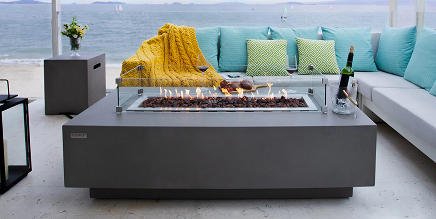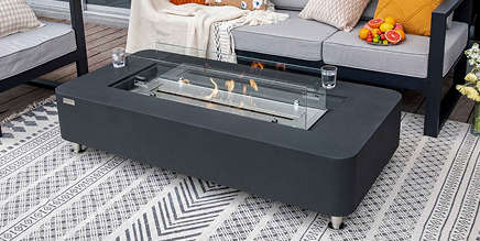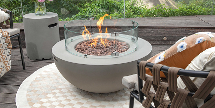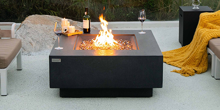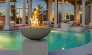
A fire bowl that is even slightly off can pull attention for the wrong reason. In a well-designed poolscape or patio, the finish on the fire feature should feel connected to the hardscape, the architecture, and the way the space is used after sunset. If you are figuring out how to match fire bowl color, the right answer is rarely just picking the closest shade on a sample chip. It is about reading undertones, finish texture, surrounding materials, and the role the bowl should play in the overall design. Because at usa firebowls we powder coat all of our own bowls in-house to insure quality. For the swimming pool project that will require color matching our clients can go to Choose a special color here and search those special colors and request a sample for verification prior to ordering their fire bowls.
How to match fire bowl color without guessing
The easiest mistake is treating the fire bowl as a standalone accent. In premium outdoor spaces, it is usually part of a larger composition that includes coping, waterline tile, pavers, stucco, metal finishes, and landscaping. A bowl can match one of those surfaces directly, but it often looks better when it coordinates with the broader palette rather than copying a single material exactly. Ready to Ship Colors – See our Ready to Ship Colors Here OR Custom Color Orders Here – Custom Orders Here Custom Colors ship in only 4-7 Days!
Start by deciding whether the fire bowl should blend in or stand out. If the goal is a quiet, architectural look, choose a color that stays within the same tonal family as the surrounding stone or concrete. If the bowl is meant to punctuate the space, a contrasting finish can work well, but it still needs to relate to something nearby, such as window frames, outdoor kitchen hardware, or dark pool tile.
That distinction matters because matching and coordinating are not the same thing. Exact matching can be beautiful when the bowl is integrated into columns, pedestals, or a formal pool design. Coordination is often the better choice when the outdoor space has variation in stone, movement in veining, or layered textures.
Start with the dominant fixed materials
The best place to begin is with the materials that are hardest or most expensive to change. In most projects, that means coping, veneer stone, tile, concrete decking, or stucco. These surfaces establish the visual temperature of the space. They tell you whether the design leans warm, cool, neutral, or mixed.
Warm palettes usually include beige, sand, taupe, cream, bronze, tan, rust, or golden undertones. Cool palettes tend to show gray, charcoal, blue-gray, white, or slate tones. Neutral palettes can move either direction depending on light and adjacent materials, which is why samples are so important.
If your pool coping is a creamy limestone and the patio has warm concrete tones, a flat cool gray bowl may look disconnected even if gray appears elsewhere in small amounts. On the other hand, a charcoal or bronze finish may create contrast without feeling out of place because it still carries warmth. The same logic applies in reverse with modern projects that use silver-gray travertine, white stucco, and black-framed glazing.
This is where many homeowners and even some installers get tripped up. They compare the bowl to one material in isolation instead of viewing it against the full exterior palette.
Read undertones, not just the main color
Two finishes can both be labeled gray and still behave very differently in the same setting. One gray may read blue, another green, another brown. The same is true for white, black, bronze, and beige. Undertones become more obvious outdoors because natural light shifts constantly throughout the day.
A practical approach is to place finish samples next to the surrounding stone or tile in daylight, then look again in late afternoon. If the bowl finish suddenly appears purple, muddy, or stark, the undertone is probably fighting the hardscape. A good match stays believable in changing light.
Use texture and sheen to close the gap
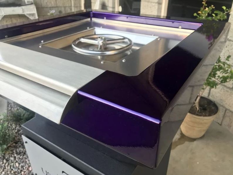
When people think about how to match fire bowl color, they often focus only on hue. Finish texture and sheen are just as important. A smooth satin surface will reflect light differently than a matte textured finish, even when both are nearly the same color.
If your space uses heavily textured natural stone, a finish with some depth or softness usually feels more integrated than a glossy surface. In a cleaner contemporary setting with porcelain tile, smooth stucco, and crisp lines, a refined satin or low-sheen finish often looks more intentional.
There is also a practical side to this. Very glossy finishes can show dust, water spots, and fingerprints more readily, especially in bright poolside settings. Highly textured finishes may conceal wear better, but they should still align with the level of formality in the design. A premium installation should look deliberate, not improvised.
Match the style of the project, not only the palette
A Mediterranean-style backyard, a transitional entertainment patio, and a sharply modern pool all call for different finish decisions. In traditional or old-world projects, warmer earth-driven colors tend to sit naturally with stone veneers and softer architectural lines. In contemporary spaces, darker neutrals, crisp whites, and refined metallic tones often deliver a stronger result.
This does not mean every modern project needs black bowls or every classic project needs bronze. It means the finish should support the design language already in place. Shape, flame presentation, and mounting style all influence how the color will read.
Where direct matching works best
There are cases where direct color matching is exactly the right move. If the fire bowls sit on matching columns clad in a specific stone or if they are intended to feel built-in, a close color match can create a clean architectural effect. This is especially effective in symmetrical pool designs where the bowls frame the waterline and should read as part of the structure.
Custom matching can also help when the project includes a highly specific finish palette that off-the-shelf colors cannot capture. For trade professionals and design-focused homeowners, this level of refinement can be the difference between a good installation and one that feels fully resolved.
That said, exact matching is not always the most attractive option. If the stone has heavy variation, trying to duplicate one note in that blend can make the bowl seem slightly wrong. In those situations, selecting a complementary solid finish is often cleaner than chasing an imperfect match.
Contrast can be the better design choice
Not every fire bowl should disappear into the setting. Sometimes contrast gives the project definition. A darker bowl against lighter coping can anchor the visual edge of a pool. A warm metallic finish can add depth to a monochromatic patio. The key is controlled contrast, not random contrast.
Good contrast usually repeats somewhere else in the space. A black or charcoal fire bowl feels more grounded when there are matching door frames, furniture details, lighting fixtures, or dark tile accents nearby. A bronze-toned bowl feels more natural when it connects to lanterns, cabinet hardware, or warm architectural metals.
Without that repetition, the bowl can look like an afterthought. With it, the fire feature becomes part of a larger outdoor design story.
Consider flame visibility and nighttime performance
Fire bowls are viewed differently at night than during the day, and finish color affects that experience. Darker finishes often make the flame appear more pronounced after sunset, which can create a dramatic effect around pools and patios. Lighter finishes can feel brighter and softer in daylight but may not frame the flame with the same intensity at night.
This is not a rule so much as a design trade-off. If the bowl is a focal point for evening entertaining, a darker finish may enhance the visual performance of the flame. If the project is built around airy, light-toned materials and daytime curb appeal, a softer finish may serve the architecture better.
The right decision depends on how the space will be used most often.
How to match fire bowl color in mixed-material spaces
Some backyards combine several strong materials at once, such as silver travertine, blue pool tile, white stucco, black metal, and natural wood. In those cases, choosing the bowl color by averaging everything usually leads to a safe but uninspired result.
Instead, identify the two most dominant materials and one supporting accent. Then choose a finish that relates to at least two of those elements. For example, a charcoal finish may tie into black window frames and gray stone while allowing blue tile to remain the accent. A warm bronze finish may connect wood tones and tan decking while softening cooler pool finishes.
This approach creates discipline. It keeps the fire bowl from trying to belong to everything at once.
Samples matter more than screen images
Outdoor finish selection should never rely on online images alone. Camera settings, screen calibration, shadow, and sunlight can all distort color. What appears soft bronze on one screen may look much darker or redder in person.
For a premium outdoor installation, physical samples are worth the extra step. View them next to the actual tile, coping, or stone whenever possible. If you are a contractor or designer, bring the sample to the jobsite instead of deciding from a showroom memory. That small effort prevents expensive disappointment later.
A handcrafted fire feature is a permanent visual element. It deserves the same level of finish review as any exterior stone, metal, or architectural surface.
When custom color matching makes sense
Custom color matching is most valuable when the project has a defined material palette and the fire bowl is a major design element, not a secondary accessory. It is especially useful for luxury pools, formal entertaining spaces, and projects where the bowls are mounted prominently on pillars, water features, or entry statements.
At that level, close coordination is not just aesthetic. It protects the investment in the broader landscape design. USA Fire Bowls works with homeowners and trade professionals who want that degree of control because the finish needs to feel tailored, not approximate.
If you are deciding between a standard finish and a custom one, ask yourself a simple question: will this bowl be seen as a centerpiece or as supporting architecture? The more visible and integrated it is, the more valuable precise color coordination becomes.
The best fire bowl color does not call attention to itself as a separate decision. It makes the whole outdoor space feel more complete, more intentional, and better built.