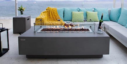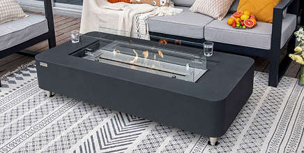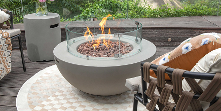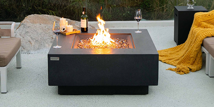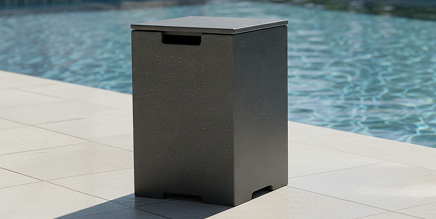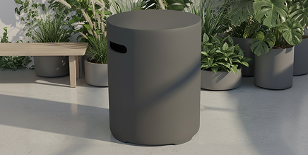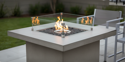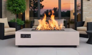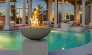
A fire bowl can either complete a poolscape or look like it arrived after every other design decision was made. Knowing how to match fire bowls to tile starts with treating the bowl as an architectural finish, not an accessory. Its color, profile, material, flame media, and placement should relate to the tile palette and surrounding hardscape with the same intention as coping, cabinetry, or exterior lighting.
For a luxury backyard, a perfect literal match is not always the goal. The best results often come from a controlled relationship: a fire bowl that repeats one color in the tile, complements its undertone, or provides a purposeful contrast that gives the space depth.
Start With the Tile’s Undertone
Tile color is more complex than its surface label. A “gray” porcelain may lean blue, green, taupe, or charcoal. White tile can be crisp and cool, creamy and warm, or lightly veined with shades pulled from natural stone. Before selecting a fire bowl finish, evaluate actual tile samples outdoors rather than relying on showroom displays or product photography.
Natural daylight changes throughout the day, while pool water introduces reflected blue tones that can shift the way every finish reads. Set tile samples beside the proposed bowl color in the intended installation area. Look at them in direct sun, open shade, and evening landscape lighting. This simple step prevents a warm bronze bowl from appearing orange next to cool gray tile, or a black finish from feeling unexpectedly blue against a warm ivory deck.
When the tile includes multiple colors, identify the dominant field color first. Then look for a secondary tone that can inform the fire bowl. For example, a pale travertine-look porcelain with subtle charcoal veining may pair beautifully with a charcoal bowl, even though charcoal is not the main tile color. The result feels considered without becoming overly matched.
How to Match Fire Bowls to Tile by Color
The most dependable approach is to choose one of three color relationships: tonal, complementary, or intentional contrast. Each can be appropriate, but the architecture and desired visual effect should lead the decision.
Use tonal coordination for a quiet, tailored look
Tonal coordination places the fire bowl near the tile’s primary color family. A matte white or soft taupe bowl can feel integrated with light limestone, cream porcelain, or sand-colored coping. Deep charcoal bowls often work naturally with slate-look tile, dark pool interiors, and contemporary concrete patios.
This approach is particularly effective when the fire bowls sit near a raised spa wall or waterline tile. The closer the bowl is to the tile, the more valuable a restrained tonal relationship becomes. It keeps the feature from visually interrupting a detailed mosaic or a dramatic stone veneer.
Be careful with exact color matching, however. Tile, grout, powder-coated aluminum, and natural stone all reflect light differently. An almost-identical color that misses the mark can look less refined than a deliberate shade shift. Aim for a coordinated family rather than an assumed one-to-one match.
Pull an accent color from the design
A fire bowl can also repeat a smaller but meaningful color already present in the project. Consider the dark frame color on sliding doors, bronze outdoor hardware, charcoal roof trim, or black accents within the waterline tile. This creates continuity across the outdoor environment and gives the bowl a reason to be there.
For example, a pool with light blue waterline tile and creamy decking may benefit from a dark bronze or matte black fire bowl if those tones appear in the home’s windows, furniture frames, or pergola details. The bowls provide visual anchoring at the pool’s edge while allowing the lighter finishes to remain dominant.
Create contrast with discipline
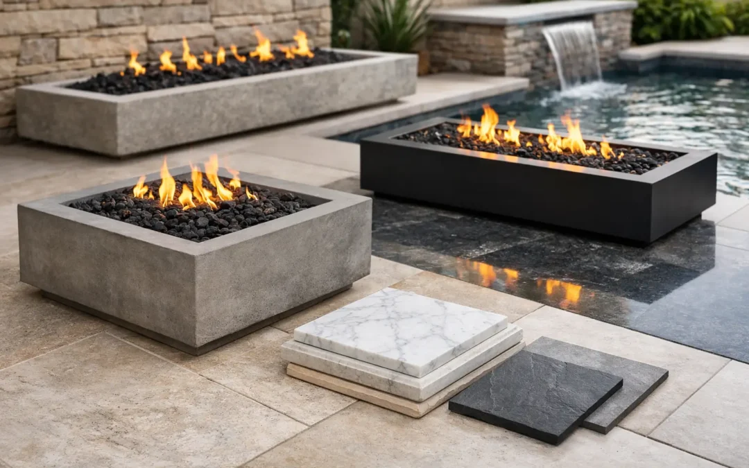
Contrast is often the right answer for large, open patios or minimalist poolscapes. A dark square fire bowl against light stone creates definition, especially at night when the flame becomes a focal point. Conversely, a light neutral bowl can lift a very dark tile wall and prevent the fire feature from disappearing into the background.
The key is to repeat the contrast somewhere else. If the fire bowl is black, include black in lighting, furniture, fencing, window frames, or planter details. One isolated high-contrast element can feel arbitrary. Repetition makes it feel intentional.
Match the Finish, Not Just the Color
A bowl’s sheen has as much influence as its color. Glossy tile beside a heavily textured or high-gloss fire bowl may create competing reflections, particularly around a pool. In most high-end exterior projects, a refined low-sheen powder-coated finish offers more flexibility because it reads cleanly in daylight and does not compete with water reflections.
Consider the character of the tile as well. Polished marble-look porcelain, smooth plaster walls, and contemporary architecture often support crisp, modern fire bowl finishes. Tumbled travertine, ledger stone, and more rustic landscapes may call for warmer neutrals, bronze tones, or a finish that feels grounded rather than stark.
Aluminum construction is especially valuable near pools because it resists rust in environments where moisture, splashing, and chemical exposure are part of everyday use. A durable powder-coated finish provides the color coordination designers want without relying on materials that can quickly look tired in a demanding outdoor setting.
Choose a Shape That Echoes the Tile Layout
Color coordination is only half the equation. A fire bowl’s geometry should acknowledge the lines already established by the pool and patio.
Square fire bowls are a natural fit with rectilinear pools, modular pavers, stacked-stone walls, and large-format square tile. Their symmetry provides a clean visual counterpoint to the movement of flame and water. They work especially well on pedestals, pool columns, and symmetrical wall returns.
Rectangle fire pits or trough-style features can complement long waterline bands, linear drain details, and narrow raised walls. Their extended flame presentation suits broad entertaining areas, though they require enough surrounding space to avoid making a compact patio feel crowded.
Round forms can soften a rigid, highly linear design, but they should be introduced thoughtfully. They often work best when circular elements already exist, such as curved seating, a round dining table, or organic planting beds. Without that relationship, a round bowl beside sharply rectilinear tile may feel disconnected.
Scale matters just as much as shape. Large-format tile and expansive decks can support more substantial bowls. On a smaller patio, an oversized fire feature may overwhelm the tile pattern and reduce circulation space. The bowl should have enough presence to read from the house while still allowing the pool, architecture, and landscaping to share the visual field.
Coordinate Fire Glass With the Tile Palette
Fire glass is the most expressive component of a fire bowl, and it deserves the same attention as the bowl finish. Since the flame media sits at the center of the feature, a poorly chosen color can undermine an otherwise well-coordinated installation.
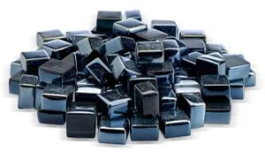
For restrained designs, clear, reflective, black, bronze, or neutral fire glass is often the safest choice. Clear and reflective media emphasize the flame and nearby water without introducing another strong color. Black fire glass can add depth to light bowls or create a dramatic, monolithic appearance in a dark contemporary design.
Colored fire glass can be highly effective when it directly relates to the tile or pool interior. A deep cobalt glass may complement blue mosaic waterline tile, while aqua tones can support a coastal palette. The trade-off is longevity of style. Strong color trends can feel dated sooner than neutral media, so use vivid glass when it is clearly supported by the broader design concept.
Avoid trying to match every shade in a variegated tile blend. Select the one tone that you want the eye to notice, then let the flame do the rest.
Consider Placement Before Finalizing the Finish
A bowl that looks ideal beside a tile sample may read differently once it is installed on a raised wall, at a pool corner, or against a planted backdrop. Placement determines what the bowl is visually paired with most often.
Fire bowls installed directly above waterline tile should generally relate closely to that tile or to the coping. Bowls set farther back on a patio can take cues from pavers, furnishings, architectural trim, or exterior cabinetry instead. For paired bowls, symmetry in placement is usually more important than identical color to every surface around them.
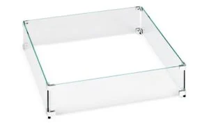
Also account for practical clearances, local code requirements, fuel routing, heat exposure, and access for service. Premium materials and a thoughtful finish do not replace proper installation planning. A qualified pool builder, contractor, or landscape professional can help ensure the feature is positioned for both visual balance and safe operation.
Use Samples and a Full-Site View
Design decisions made from isolated swatches are where many otherwise polished projects go wrong. Place physical samples together: tile, grout, coping, stone, powder-coat colors, fire glass, and even a furniture fabric if it is a major part of the patio palette. Step back and view the group from the distance where guests will first see the poolscape.
This is also the point where custom color matching can make a meaningful difference. For projects with distinctive tile, specialty stone, or a specific architectural paint color, a handcrafted fire bowl with a tailored finish can provide the cohesion that off-the-shelf outdoor products rarely achieve. USA Fire Bowls builds its aluminum fire features in California with customization in mind, helping homeowners and trade professionals specify a finish that belongs in the project rather than merely fits within it.
A well-matched fire bowl should make the tile feel richer, the water more luminous, and the entire outdoor space more finished. Choose the relationship that supports the architecture, test it in real light, and let the flame be the final detail that brings the palette to life.